I've always wanted to explore Storybook in a more hands-on way, but the software I work with professionally tends to be pretty complex, making it hard to test out in a contained environment. So when it came time to rebuild my portfolio, it felt like the perfect opportunity: a simple, self-contained project where I could finally get stuck into Storybook and build something that actually felt cohesive and maintainable.
Planning the Structure
The planning phase was surprisingly fluid. I used Cursor AI to write the code—prompting and tweaking as I went—which turned out to be quite a creative process. I didn't go in with a strict blueprint, but as I honed the visual style, the structure began to form organically. Once I had something I liked aesthetically, I took a step back and started simplifying the code into reusable components.
In terms of structure, I looked at a lot of typical portfolio layouts and leaned on my old UX Folio content for direction. I already had most of the text and case study material, so this project was more about reshaping it to fit a structure I actually enjoyed using and could maintain more freely.
The site ended up having two core areas:
- Case Studies: aimed at potential employers
- Blog: a more casual space for me to reflect on the work I'm doing in real time
I also did a bit of research into job applications to get a better understanding of what recruiters might be looking for in a portfolio. That helped guide some of the content choices.
Designing With Playfulness
I wanted the visual design to feel clean and readable—but also playful. I've always loved colour and geometry, so I leaned into that while keeping everything accessible and minimal.
The red and blue palette comes from my uni days (and, honestly, from my wardrobe). It's stuck with me as a bit of a personal brand. And when it comes to design systems, I've always appreciated Google's Material Design for how structured yet expressive it can be, so I borrowed quite a bit from that—especially in typography.
Roboto is the main font, paired with greys and an off-black background to keep things legible and soft on the eyes.
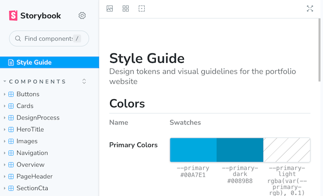
Building the Design System in Storybook
The goal with the design system was simple: consistency and maintainability. I didn't want to have to rebuild or restyle components on every new page. Storybook gave me a centralised place to design once and reuse everywhere.
Most of the design work happened directly in Cursor. I did try shifting things into Figma at one point, but I found it easier to manipulate the code directly and push it to Storybook. So, in a way, I did the whole design process backwards.
The system includes:
- Basic components like cards and buttons
- Page sections like footers and call-to-actions
- Custom bits like the hero image and collapsible overview
You can explore the full Storybook design system here
Challenges Along the Way
It wasn't all smooth sailing. One of the early missteps was writing a script to pull all the CSS into Storybook, which turned into a complete mess. The CSS had been written custom per page, so moving to a component-based structure required a full site restructure.
I also had a lot of duplicate code from generating things with AI. At a certain point, I had to stop and refactor large chunks to make it manageable. The "Overview" component was particularly temperamental—it kept breaking, and it took multiple rounds of tweaking to get it to function like the prototype.
Even now, not all components are integrated into the design system. Some are still custom, living only in specific pages. But that's fine. It's a work in progress.
The Final Site
In the end, I'm proud of how it turned out. The site feels simple and consistent, and the code is easy enough for me to update using free tools and my current skill level.
Some highlights for me:
- The hero image feels bold and distinctive
- The collapsible overview is a fun, quirky addition
- And the Storybook interface actually looks like a proper design system—neat, structured, and easy to navigate
Using Storybook has really helped give the whole portfolio a more professional polish.
What's Next?
Because I've got full control over the code, I can expand the system with more custom components whenever I want—something most website builders just don't allow. For now, my main goal is to test how easy it is to publish new blog posts and keep the content fresh.
Looking ahead, I hope this site encourages me to share my learnings more regularly. I've already picked up so much about structuring a design system, and this experience with Storybook will absolutely inform how I approach similar challenges in future professional projects.
Thank you for reading!
Want to work with me? Feel free to contact me!
...or just say hello on my social media.